
After using this for a few days, I can safely say it's as good as the other Kat Von D palettes. Maybe better, purely because this one is all powder shadows, no creams involved.
I usually use the High Voltage primer in Skin with all of my shadows (I'm on the lookout for something else, I feel an eye primer post coming on) but I've also tested Stellar & Smoky too.

As mentioned on the sneak peek post, this packaging is absolutely stunning. Yes, it's not very practical to carry around with you because, being made of cardboard, it may not be the sturdiest packaging in the world. It's also far too large to stick in your bag. Taking it away with you on a trip? Sure, keeping it in the plastic sleeve it comes in would help in not getting it messed up. Toting it around for touch-ups? Nope, you'll have to take something else along, this palette is too big for that (it is roughly the same size as a hard-back book for reference).

The first row of shadows: Tijuana (black with gold glitter), Taxidermy (shimmery brown), Hollywood (shimmery golden) & Peanut (shimmery Ivory). Underneath is a mini High Voltage primer in Skin (matte pale yellow-toned).
I'm surprised because although Hollywood & Taxidermy look very warm-toned, they're still wearable even if you aren't a fan of warm-toned shadows. Taxidermy puts me in mind of MAC's Chocolate Brown pigment. Peanut is an odd one, it looks like a shimmery champagne in the palette, once on the skin it's definitely more of an ivory colour. Makes a great inner eye highlighter. Tijuana is amazing, it looks pretty much like any other black with gold glitter until you put it on. I used it dry & the glitter didn't fall away, get blended out or just become unnoticeable, it was quite obviously there.
 |
| Tijuana, Taxidermy, Hollywood & Peanut - flash |
 |
| Tijuana, Taxidermy, Hollywood & Peanut - outside, no flash |
With the swatches that were pictured using flash on the camera, Peanut does look more champagne-toned, the no-flash picture is more accurate of how it shows up on my skin (GA Lasting Silk shade #2 for reference). HV primer in Skin was used under the swatches.

The second row consists of Redemption (matte purple-ish blue), Solitude (shimmery purple), Heartkiller (a satinish light pink with silver glitter) & Baudelaire (shimmery silver). The primer is Stellar (shimmery with a slight pinkish sheen).
Redemption has a fantastic texture for a matte. Soft, non-chalky & easy to blend. It's somewhat of an odd one shade-wise, in certain lights it looks very blue, something the swatch pics will illustrate, in others it definitely pulls more purple. I think the choice of primer also affects it. Used over Skin, as in the pictures, blue is how it comes across. Yet, with Stellar as the base, the purple tones are amped it.
Solitude initially came out in the Memento Mori palette but the two seem to differ slightly. MM's version has a pink tinge, not unlike MAC's Beautiful Iris. The version here doesn't have as strong a pink tinge & it's a little more pigmented.
Solitude initially came out in the Memento Mori palette but the two seem to differ slightly. MM's version has a pink tinge, not unlike MAC's Beautiful Iris. The version here doesn't have as strong a pink tinge & it's a little more pigmented.
Heartkiller isn't as frosty or shimmery as the other shadows yet it isn't totally matte, rather puts me in mind of MAC's more sheeny satin finish shadows. The glitter is tiny, like the two other glitter shadows here, it will show up wet but remains quite subtle dry. This particular shadow looks gorgeous over the Stellar primer, it gives Heartkiller the most beautiful glow.
Baudelaire is a cool-toned, very shimmery silver. Great pigment here, it's not at all wishy-washy but it can be applied to look more subtle. I haven't noticed it pulling blue on me at all but YMMV.
Baudelaire is a cool-toned, very shimmery silver. Great pigment here, it's not at all wishy-washy but it can be applied to look more subtle. I haven't noticed it pulling blue on me at all but YMMV.
 |
| Redemption, Solitude, Heartkiller & Baudelaire - with flash |
 |
| Redemption, Solitude, Heartkiller & Baudelaire - outside, no flash |
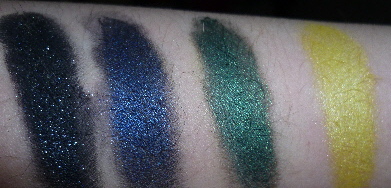
The last row of shadows - Monastary (black with silver glitter), Poe Blue (shimmery midnight blue), Nite Owl (shimmery dark green) & Lemmy (shimmery yellow-gold). The primer here is Smoky (matte dark grey).
Whilst Monastary isn't a unique shadow, there are lots of black shadows with silver glitter available, it is a nice one. Like Tijuana, the glitter shows up on the skin more than it does with a lot of other black, glittery shadows. It's less like MAC's Black Tied & more like NARS' Night Breed. Darker black with more prominent glitter.
Poe Blue is a nice example of a blackened blue. Soft, buttery texture, great pigmentation. Would make a great liner if used wet.
I wasn't sure what Nite Owl reminded me of at first. It wasn't until I swatched it that I thought about Illamasqua's Liquid Metal in Stoic. Stoic would make a great base for Nite Owl, the colours are very similar.
I'm not a big fan of golds, especially those that pull yellow. For that reason, Lemmy isn't one of my favourite shadows in the palette. A cousin to MAC's Golden Lemon pigment, it isn't really my thing although using it over the Smoky primer tones down the yellow a tad. My lack of love for this shadow is all about my colour preference, I really can't knock it in terms of texture, pigmentation or blendability.
Going back to Smoky primer, I like this quite a bit. It may be matte but the texture isn't horrendously dry. The colour is great, really makes shades like Poe Blue & Nite Owl pop. Another fab feature is, given how dark it is, you can see exactly where you've applied & blended this, and it does blend quite easily.
Going back to Smoky primer, I like this quite a bit. It may be matte but the texture isn't horrendously dry. The colour is great, really makes shades like Poe Blue & Nite Owl pop. Another fab feature is, given how dark it is, you can see exactly where you've applied & blended this, and it does blend quite easily.
 |
| Monastary, Poe Blue, Night Owl & Lemmy - flash |
 |
| Monastary, Poe Blue, Night Owl & Lemmy - outside, no flash |
Again, the swatches had Skin primer as their base.
 |
| Skin, Stellar & Smoky primers |
All in all, this palette is great value. Twelve shadows, three mini primers, two perfumes & a set of lashes at $55 (from Sephora) is nothing to sneeze at, especially given the attention to detail with the packaging.
The few minor quibbles I have are just that: minor. The palette isn't overly travel friendly, there isn't really a highlighter shade & there's no glue for the false lashes.
The few minor quibbles I have are just that: minor. The palette isn't overly travel friendly, there isn't really a highlighter shade & there's no glue for the false lashes.
A) To be honest, I'm not overly bothered about not being able to carry this around. I have other stuff that would work to use as a touch-up if needed.
B) Some may be able to use Peanut. Myself, I find it way too shimmery for the browbone but again, that's personal preference. It does make a great inner-eye highlightet though. There's other stuff in my stash that I use for browbone highlighters so it's not that much of an issue. It would be nice if at least one of Kat's palettes did feature a more matte highlight option at some point.
C) Chances are, if you're into your false lashes, you'll already have some glue lying around. The back section that houses the perfume roller-ball could have been altered slightly to incorporate a little bottle of eyelash glue somewhere.
This is a truly gorgeous palette & the shadows are of great quality. If those minor quibbles don't bother you so much, The Tattoo Chronicles is certainly worth investigating.
love the eyeshadow!!!They all have amazing colors.High quality and best collection ever!
ReplyDeleteA definite keeper:)
Fabulous!
Just got it (my lovely brother brought it back with him in France after vacations in the US), and I really love it, almost as much as my Urban Decay palettes (but not far ;)).
ReplyDelete