I'm going to preface this post by saying that I do already own all of the shadows in the Burning Heart palette as singles too. Why would I buy them again as a palette? I'm absolutely ridiculous at packing. If I go somewhere & take make-up with me, I get carried away & put things in a "safe place" where I can't find them once I reach my destination or I promptly lose things. Getting these four colours in the palette seemed like a sensible option for a clueless packer, such as myself.
With that out of the way, on to the pretty pictures!
With that out of the way, on to the pretty pictures!
On the back, there's details of the colours contained inside. I absolutely love that the actual colours are illustrated, not just listed as names. Makes things so much easier if you're in a rush or a bit bleary-eyed in the morning.
Opening the palette reveals a mirror in the top lid, and four generously-sized shadows housed below. These are much bigger than MAC shadows.
Going from the top left, the first of the colours is Flamepoint, a vivid, matte orange.
 |
| Flamepoint |
Usually, I'm not big on orange, but I love Flamepoint, it's so vibrant & bold. Don't let the fact that it's a matte texture fool you in to thinking this will be a hard, chalky shadow; it really isn't. It applies & blends easily, all without ending up as a washed-out version of what you see in the pan.
The next shade is Buttercupcake. Also a matte, this is a bright yellow shadow.
 |
| Buttercupcake |
As with Flamepoint, what you seen in Buttercupcake's pan is exactly what you get upon application. It's not at all wishy-washy, applies vividly & blends oh-so-easily.
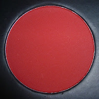
The first colour on the bottom row comes in the form of Love +, a bright, true-red shadow.
 |
| Love + |
The last colour in Burning Heart is the gorgeous Poison Plum, a stunning, bold purple.
 |
| Poison Plum |
As the photo shows, there's a bit of a pearly sheen to Poison Plum. That doesn't mean that it's sparkly, it's a very subtle shimmer that serves to amplify the shade rather than giving it a glittery or shimmery finish. What I love about Poison Plum is that it isn't overloaded with red.
Now for the swatches! As with the majority of swatches I've done, these were all done using the shadows dry and applied straight on to bare skin.
 |
| with flash |
 |
| with flash |
 |
| outside - no flash |
 |
| Outside - no flash |
Out in direct sunlight (or what's passing for sunlight at the moment around my neck of the woods), Poison Plum looks a little more matte. All four shadows are still very bright & vibrant, even without the flash.
Obviously, if you don't care for bright colours, Burning Heart won't do much for you. For those that like a bit (or a whole lot) of colour, this palette is a must, especially if you gravitate towards these kind of colours. All four shadows have outstanding pigmentation, a great texture that isn't chalky, stiff or difficult to work with.
Personally, I'm a huge fan of Sugarpill's products & this palette is absolutely no exception.
Personally, I'm a huge fan of Sugarpill's products & this palette is absolutely no exception.


No comments:
Post a Comment