The latest palette from the Kat Von D line at Sephora, Angeles comprises of browns, blues & turquoise. In this palette, there's 3 shades that have made an appearance in previous palettes: Leather (in both Beethoven & Ludwig palettes), Rehab (in the Truth palette) & Peggy (Memento Mori). As with most of the palettes, there's a cream shadow inside.
The packaging, as always, is stunning. The box features rosaries in gold. On the actual palette, they're black.
 |
| Venus, Leather, Specimen, Rehab |
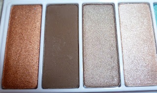
The left side of the palette houses the brown/neutral shades. There's one matte shadow here, Leather. I don't wear dark brown shadows much but when I do, I always reach for Leather. There's absolutely no red tones to it, It applies well & is really pigmented.
Venus is a bronze/copper shade that has a fair amount of an orange tinge to it. Those that prefer cooler tones may not love it so much.
Specimen is a shimmery mid brown. In the picture, it looks like there's a greyish tone to it but it doesn't look that way in person.
Rehab is a pearly beige shade. Although it looks quite golden-toned in the pan, it doesn't translate as golden on to the skin. It reminds me of Starcrossed True Romance pigment, also from the Kat Von D line.
 |
| Venus, Leather, Specimen, Rehab |
 |
| Peggy, Bukowski, Bellbottom, Morphine |
Peggy is a gorgeous, vivid turquoise shimmer with a golden sheen to it. Bukowski is described on the Sephora site as being a pearly aqua. It puts me in mind, slightly, of MAC's Parrot. Bukowski is a little more toned down in colour & it's not quite as starkly frost as Parrot.
Bellbottom looks a little odd here because it had suffered a mishap. When I opened the palette, Bellbottom was smashed. I managed to repress it & although it may not look as perfect as the other shadows, it's still very useable. Colour-wise, it's a mid-blue but it has a slight green sheen to it. Morphine is the cream offering in the palette. Unlike previous KVD creams, this is more of a highlighter. When applied, the white-ish base barely shows & the blue/turquoise shimmers really pop. In order to use this as a lid shade, you'd really need to pack a lot on, which would lead to creasing. For that reason, it's best used an inner-eye and/or browbone highlight shade.
Bellbottom looks a little odd here because it had suffered a mishap. When I opened the palette, Bellbottom was smashed. I managed to repress it & although it may not look as perfect as the other shadows, it's still very useable. Colour-wise, it's a mid-blue but it has a slight green sheen to it. Morphine is the cream offering in the palette. Unlike previous KVD creams, this is more of a highlighter. When applied, the white-ish base barely shows & the blue/turquoise shimmers really pop. In order to use this as a lid shade, you'd really need to pack a lot on, which would lead to creasing. For that reason, it's best used an inner-eye and/or browbone highlight shade.
 |
| Peggy, Bukowski, Bellbottom, Morphine |
As with the previous swatches, these were applied dry on to bare skin. Morphine is actually more shimmery in person than the swatch would lead you to believe.
As with all of the other palettes, quality-wise, I love the Angeles palette. No iffy pigmentation or bad textures here. Although Morphine has a more limited use than previous creams from the line, I will probably end up using this more than most as it makes for a pretty, shimmery highlight shade. I don't use blues a lot but since most of the shades err on the turquoise side, I find them more useable for me. Even Bellbottom has a green sheen to it that stops it from being a plain, out & out blue.
The brown side of the palette is quite pretty & will definitely be called into action for more neutral looks. I suspect that I won't be using Venus quite as much, as it's a touch on the warm side for me. It will be useful for warming up the other shades though.
Packaging is gorgeous as always, although the white palettes can get a little scruffy looking just because they're white. The brushes are only really useful as liner brushes.
All in all, if these colours appeal to you, Angeles is a good palette to get.
All in all, if these colours appeal to you, Angeles is a good palette to get.


No comments:
Post a Comment